
Summary
The Promotion Analytics module, found under Insights > Promotion Analytics 2.0, gives your team a real-time view of how planned promotion spend compares to actual deductions across your entire promotion calendar. The module includes four reports: Spend Analysis, Unit Analysis, Bump Chart, and ROI Analysis. Together, they let you move from a high-level annual overview down to a single promotion's deduction detail in just a few clicks — helping you identify variances, evaluate trade efficiency, and determine which promotions are worth repeating.
When to Use This
- You want to compare planned (expected) spend against actual (deduction) spend
- You need to identify which month, customer, product group, or fund type is driving a spend variance
- You want to understand your trade rate — how much of each revenue dollar is going to trade
- You want to find promotions that actualized with unexpected deductions, or deals that were planned but never received a deduction
- You want to use expected spend by fund type as a forward-looking accrual estimate
- You are evaluating which promotions to repeat based on ROI
Prerequisites
- Promotions: Must be set up in Vividly Planning with expected spend populated
- Deductions: Must be reconciled in
Business > DRMfor actual spend to populate in Spend Analysis - Revenue upload (optional, but required for trade rate): Upload via
Business > Revenue Dollarsto unlock trade rate - Syndicated / POS data: Required for the Bump Chart and for actual (vs. expected) ROI calculation
- Hierarchies (optional): Hierarchical filtering and rollup views are available but must be configured — contact your CSM to enable
Navigating to Promotion Analytics
- From the left navigation, go to
"Insights">"Promotion Analytics 2.0". - You will see four tabs at the top of the page:
"Spend,""Unit,""ROI,"and"Bump Chart."
Using Spend Analysis
- Select the
"Spend"tab if it is not already active. - Select the year you want to analyze using the year selector.
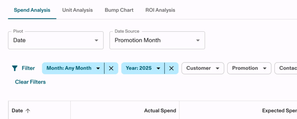
- Choose your
"Date Source":"Promotion"(default — recommended for sales teams): Maps actual deduction dollars to the month the promotion ran. Use this to evaluate how your planned promotions performed."Spend": Maps actual deduction dollars to the month the deduction was received. Use this to track real cash flow regardless of when the promotion took place.
- Review the high-level table and graph. You should see:
- Expected Spend — drawn from your planned promotions
- Actual Spend — drawn from reconciled deductions in DRM, updated in real time
- Differential — the dollar difference between expected and actual
- Review the graph below the table for a visual trend of expected vs. actual spend across the year.
Drilling Down into Variances
- Click the
"Differential"column header to sort and bring the largest variance month to the top. - Click on a specific month row to filter the table to that time period. You should see the table update to show only that month's data.
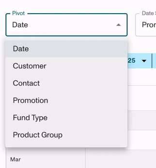
- Use the
"Pivot"dropdown to break down results by one of the following:- Date
- Customer
- Contact
- Promotion
- Fund Type
-
- Product Group
-
- Sort the pivot table by the
"Differential"column again to identify which customer or product group is driving the variance. - To isolate a specific customer: click the customer filter field, type the customer name, and select it. Add a second pivot (e.g.,
"Product Group"or"Promotions") to continue drilling down. - Click on a specific promotion row to open the promotion details panel.
- Navigate to the
"Analytics"tab within the promotion details. You should see:- A graph comparing actual spend vs. expected spend for that promotion
- A table of all deductions reconciled to this promotion, listed by check number, date applied, units, and actual spend amount
- A cumulative spend-over-time chart
- Use this view to identify anomalies such as:
- Double deductions applied to the same promotion
- Large unexpected deduction amounts
- Spend that came in significantly over or under what was planned
Investigating Underspend and Unexecuted Deals
- Clear any active filters and return to the full-year view.
- Change the
"Pivot"to"Fund Types." - Select a specific fund type in the filter — for example,
"Slotting." - Change the
"Pivot"to"Promotions." - Sort by
"Actual Spend"ascending. Promotions with $0 or very low actual spend but high expected spend indicate deals that may not have executed. - Use these findings to follow up with your broker or retailer: Did the deal execute on shelf? Was a deduction ever sent?
Note: This is also a useful way to see two stories in one view — where you overspent, and where planned spend never actualized. Both tell you something important about your promotional execution.
Using Expected Spend as an Accrual View
- Change the
"Pivot"to"Fund Types." - Return to the full-year view (deselect any month filters).
- Review the
"Expected Spend"column. This shows your total planned trade liability by GL or fund type — useful as a forward-looking accrual estimate for the year.
Additional Controls
"Show all promotions"toggle:- On: Includes promotions in all statuses (pending, submitted, approved, running, completed).
- Off: Shows only approved, running, and completed promotions. Use this to remove noise from unapproved deals when reviewing actuals or accruals.
"Set Default View": Click to save your current filter and pivot configuration. This setting applies only to your user account and will not affect other team members' views.- Download / Export: Use the download option to export the current view to a file for offline analysis.
Filter Panel Options
- Use the filter panel to narrow results by:
- Customer or customer hierarchy level
- Product or product hierarchy level
- Fund types
- Data source (Spend vs. Promotion)
- Promotions
Customizing Table Columns
- In certain pivot views, you can show or hide specific columns in the data table. Use the column settings to focus on the metrics that matter most for your analysis.
Promotion Line Duration (Beta)
- A Promotion Line Duration date range option is available in beta. This option evenly spreads values across the number of days within a promotion line's duration — useful for promotions that span multiple months. Contact your CSM if you would like to evaluate this feature.
Using Unit Analysis
- Select the
"Unit"tab. This report mirrors Spend Analysis but displays volume (units) instead of dollar amounts — useful for evaluating trade activity from a volume perspective.
Using Bump Chart
- Select the
"Bump Chart"tab. Select a customer and product group to load the chart. - Review the chart for:
- Weekly units (base and incremental)
- Compliance (did the retailer execute the promotion?)
- Average retail price
- Promotion overlays showing when planned promotions occurred
- Hover over a data point to see metrics for that specific week.
- Click on a promotion overlay to select it. The stats panel on the right will update to show lift, compliance, and unit performance for that promotion window.
- Select a custom date range to zoom into a specific period of interest.
- Evaluate whether base units increased following a promotion — a sustained increase in base units signals that the promotion brought in new repeat purchasers and may be worth repeating.
Using ROI Analysis
- Select the
"ROI"tab. - Use the pivot to sort promotions by ROI (highest to lowest) to identify your most effective promotional activity.
- Click on a promotion to view the underlying lift, base units, incremental units, and ROI fields.
- Use the
"Duplicate Promotion"button on high-ROI promotions to use them as a template when planning future activities.
Note: ROI calculation requires: promotions in Closed status, lift enabled, product margin populated, and pricing configured. See ROI Analysis - Overview for full prerequisites and formulas.
Why Spend Analysis Matters
Spend Analysis works as soon as you have planned promotions and cleared deductions. No budget or forecast is required to get meaningful insight:
- Planned vs. actual spend in real time. As deductions reconcile in DRM, they automatically appear in Spend Analysis. You always have an up-to-date view of how your planned spend is tracking against what actually came in.
- Where you are overspent and underspent. Use the Differential column and pivots to instantly pinpoint which months, customers, or product groups are driving unexpected spend — without building a single spreadsheet.
- Which deals executed and which did not. Filter by a fund type like slotting, pivot to promotions, and sort by actual spend to identify deals that were planned but never received a deduction. This is actionable intelligence for broker and retailer conversations.
- A forward-looking accrual estimate. Pivot by fund type and view expected spend across the full year to understand your total planned trade liability by category — useful for finance and leadership reviews.
Expected Result
After working through these steps, you will have a clear picture of your promotional trade spend at any level of detail — from a full-year summary down to a specific promotion and its individual reconciled deductions. If revenue data is loaded, you will also see your trade rate, enabling you to assess trade efficiency at the customer, product, and fund type level. You will be able to identify the root cause of spend variances and take informed action — all within a few clicks, directly in Vividly.
Frequently Asked Questions (FAQs)
Q: What is the difference between the "Promotion" and "Spend" date source settings?
A: "Promotion" maps deduction dollars to the month the promotion ran — the default and preferred setting for sales teams evaluating promotion performance. "Spend" maps deduction dollars to the month the deduction was actually received, regardless of when the promotion ran — preferred for finance teams tracking real cash flow.
Q: Why is there no "% Difference" column?
A: The % Difference column was removed based on user feedback. The "Differential" (dollar difference) column remains and is the primary metric for identifying spend variances.
Q: Does the "Show all promotions" toggle affect exports?
A: Yes. Toggling "Show all promotions" on or off changes which promotions appear in the table. Only the currently visible promotions are included in a downloaded export.
Q: Who can see my Default View?
A: Default View is saved per user only. Setting it does not change any other team member's view.