Vividly's Promotion Planning UI has been redesigned to make creating and managing promotions faster and more flexible. The previous multi-step flow has been replaced with a single-page, tabbed experience — so you can move freely between sections, make edits at any point, and see your promotion come together in real time without losing your progress.
What's Changed
If you've created promotions in Vividly before, this section walks you through the key differences between the previous experience and the updated one. Everything you used to do is still here — it's just organized in a way that's faster and easier to navigate.
1. From a multi-step wizard to a single-page experience
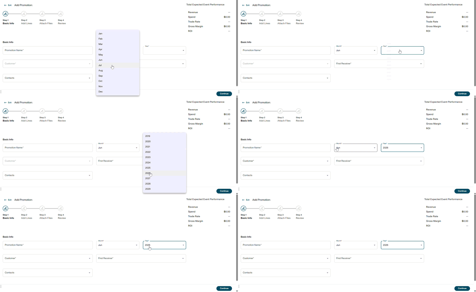
The previous UI required you to move through 4 steps in order — Basic Info, Add Lines, Attach Files, and Review. If you needed to go back and change something, you had to click backward through each screen.
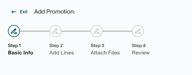
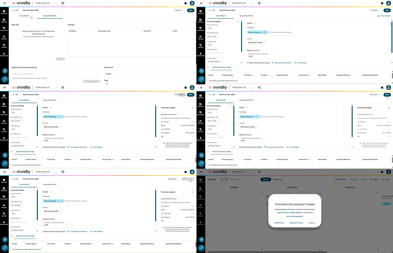
The updated UI replaces all of that with a single page organized into two tabs. You can switch between Tab 1 and Tab 2 at any time, make edits freely, and never lose your progress. There is no longer a fixed order to follow.
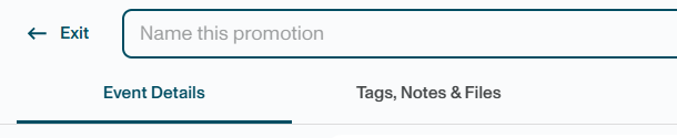
2. Basic Information and Promotion Lines are now on the same screen (Tab 1)
Previously, Basic Information (customer, month/year, first receiver) lived in Step 1, and Promotion Lines (fund type, product, dates, spend) lived in a separate Step 2. You had to complete one before seeing the other.
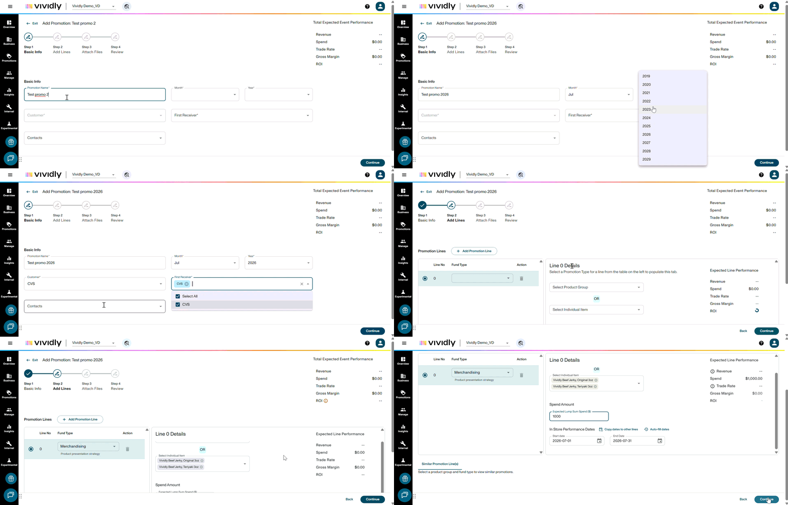
Now, both are available on Tab 1 — Basic Information at the top, Promotion Lines below. You can see and edit everything in one place, and a live Promotion Insights panel on the right shows your total expected spend, trade rate, and gross margin updating in real time as you build your lines.
3. Files, Comments, Status and Tags are now on Tab 2
Uploading files, adding comments, setting tags, and choosing a promotion status were all formerly part of Step 3 — a separate screen you could only reach after completing Steps 1 and 2.
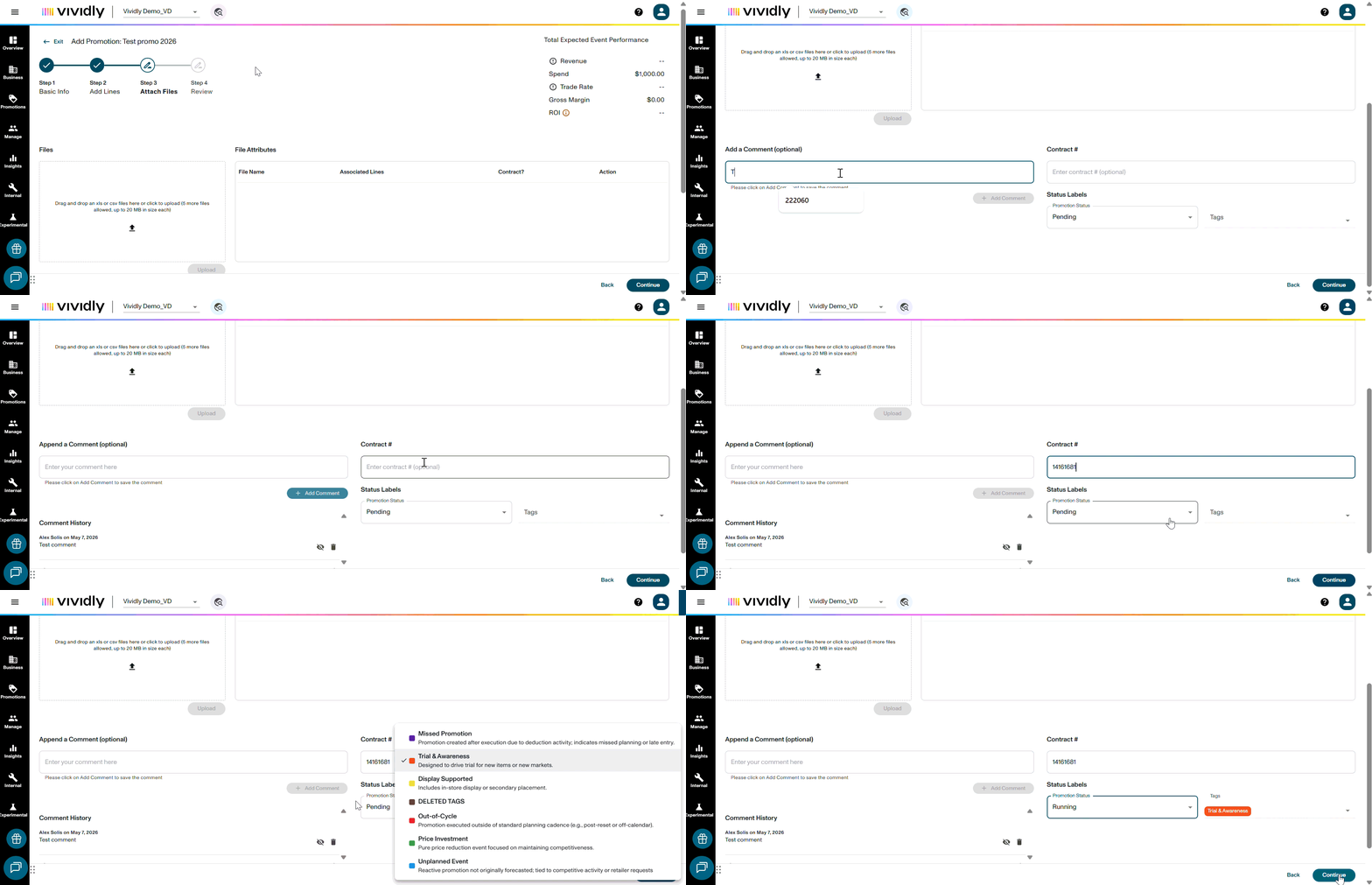
With the updated UI, all of this lives on Tab 2, which you can access at any point during the process — even before your lines are complete. This makes it easier to attach a contract or add a note as soon as you have it, without waiting until the end.
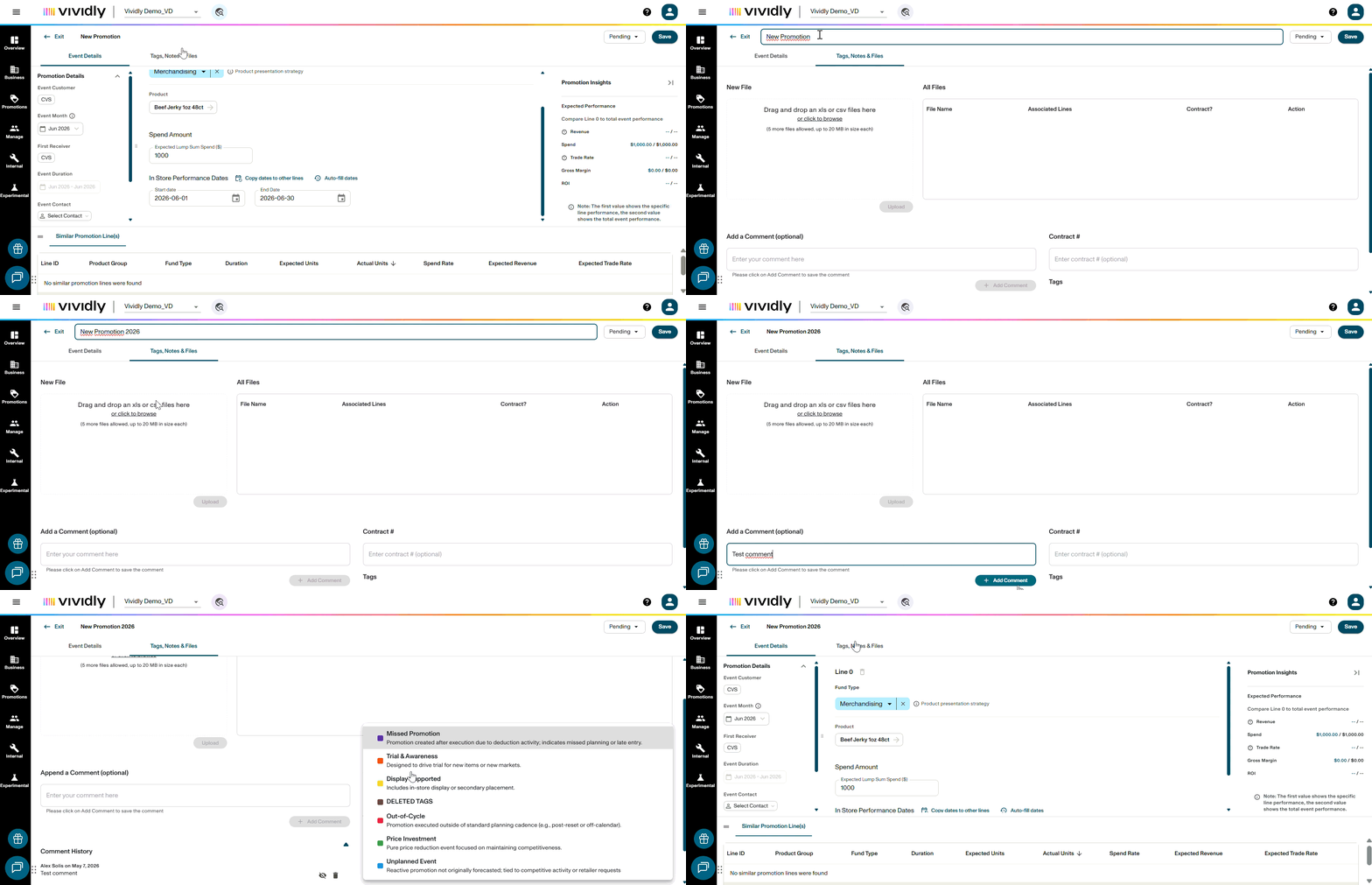
4. The Review step is now built into the experience
Prior to the updated UI, there was a dedicated Step 4: Review summary screen you reached at the very end to confirm your promotion details before submitting.
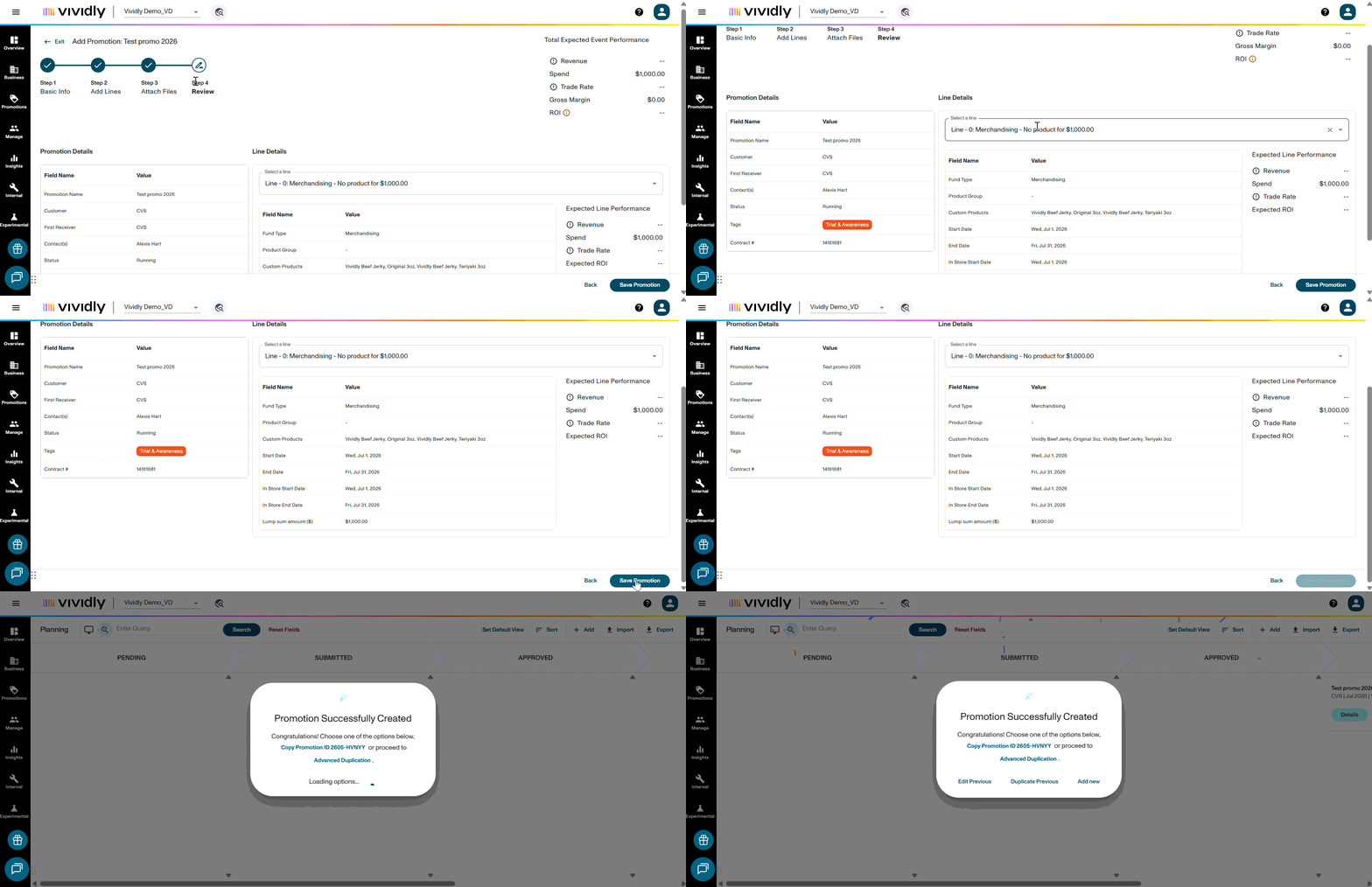
With the update, the Promotion Insights panel in Tab 1 gives you a live, running summary of your promotion's financials as you work. You can review your details at any time directly within Tab 1, then submit from Tab 2 when you're ready.
5. Promotion dates can now span multiple months
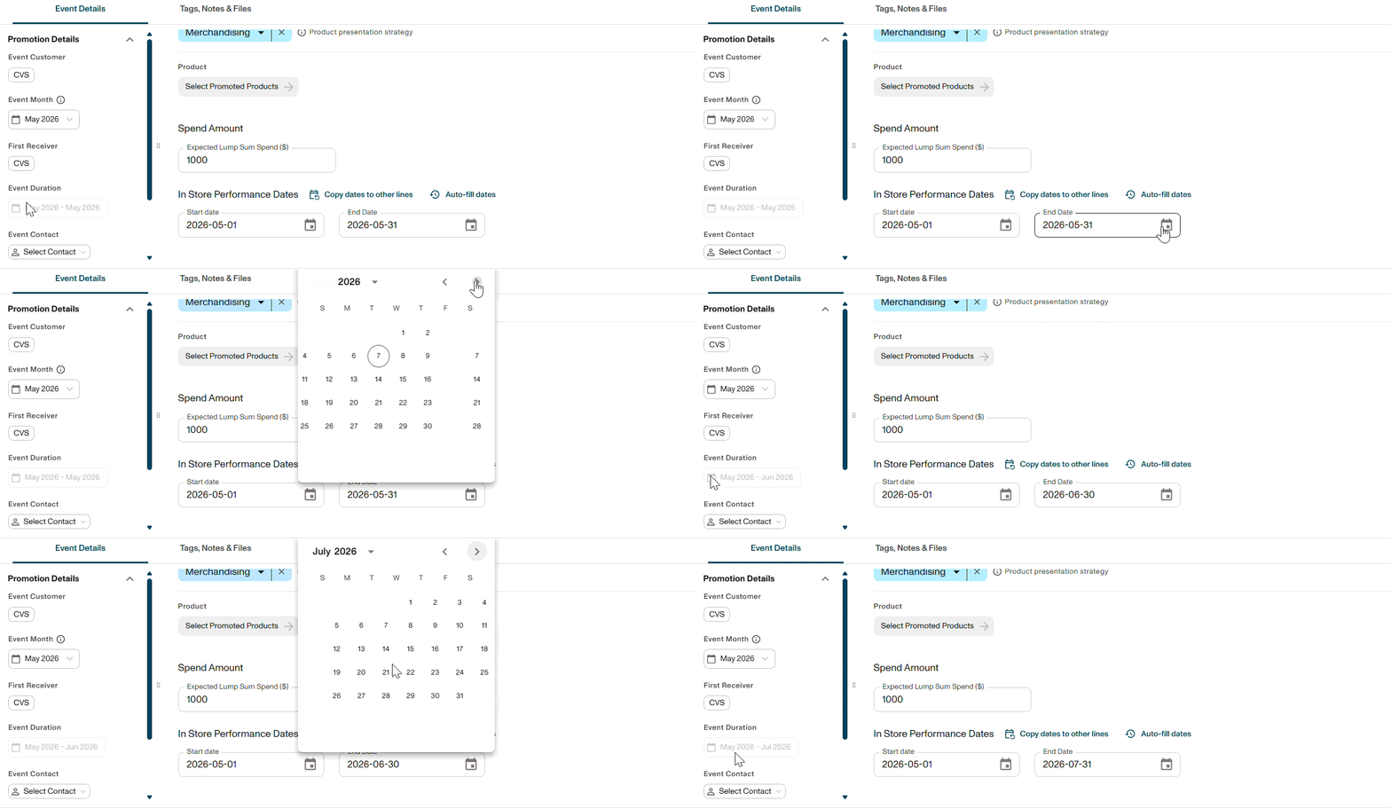
There was a previous requirement for promotions to run for a single month at a time as it only allowed you to select a Month and Year for a promotion, which meant longer-running deals — like a January–March promotional agreement — required three separate monthly promotions.
If your account has duration-based planning enabled, you will now see Start Date and End Date fields, allowing you to create a single promotion that spans multiple months. The Month and Year fields are still shown and auto-populate from your Start Date, so filtering and reporting work the same as before.
6. You can now search for products by product number
In the previous UI, products and product groups could only be searched by name.
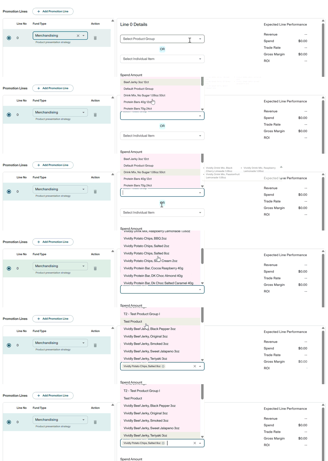
This update adds the ability to search by product number as well — making it faster to find the right item, especially for teams managing large product catalogs.